Color
Color creates meaning and communicates hierarchy, state, and brand.
Color scheme
Link to “Color scheme”The page follows the subpages of the
M3 color guidance in order. All
imports come from @material/web/labs/gb/styles/color/.
Color system
Link to “Color system”The system turns a few inputs into a complete, accessible set of colors. Dynamic
color starts from a source color, runs it through a scheme algorithm, derives
five key colors (primary, secondary, tertiary, neutral, neutral variant) plus
error, builds a tonal palette for each in HCT (hue, chroma, tone), and assigns
tones to color roles. Roles come with a pairing rule: a color and its on-
color are chosen so text and icons stay legible. Each role has three contrast
levels (standard, medium, high), so the same scheme can serve people who need
more contrast.
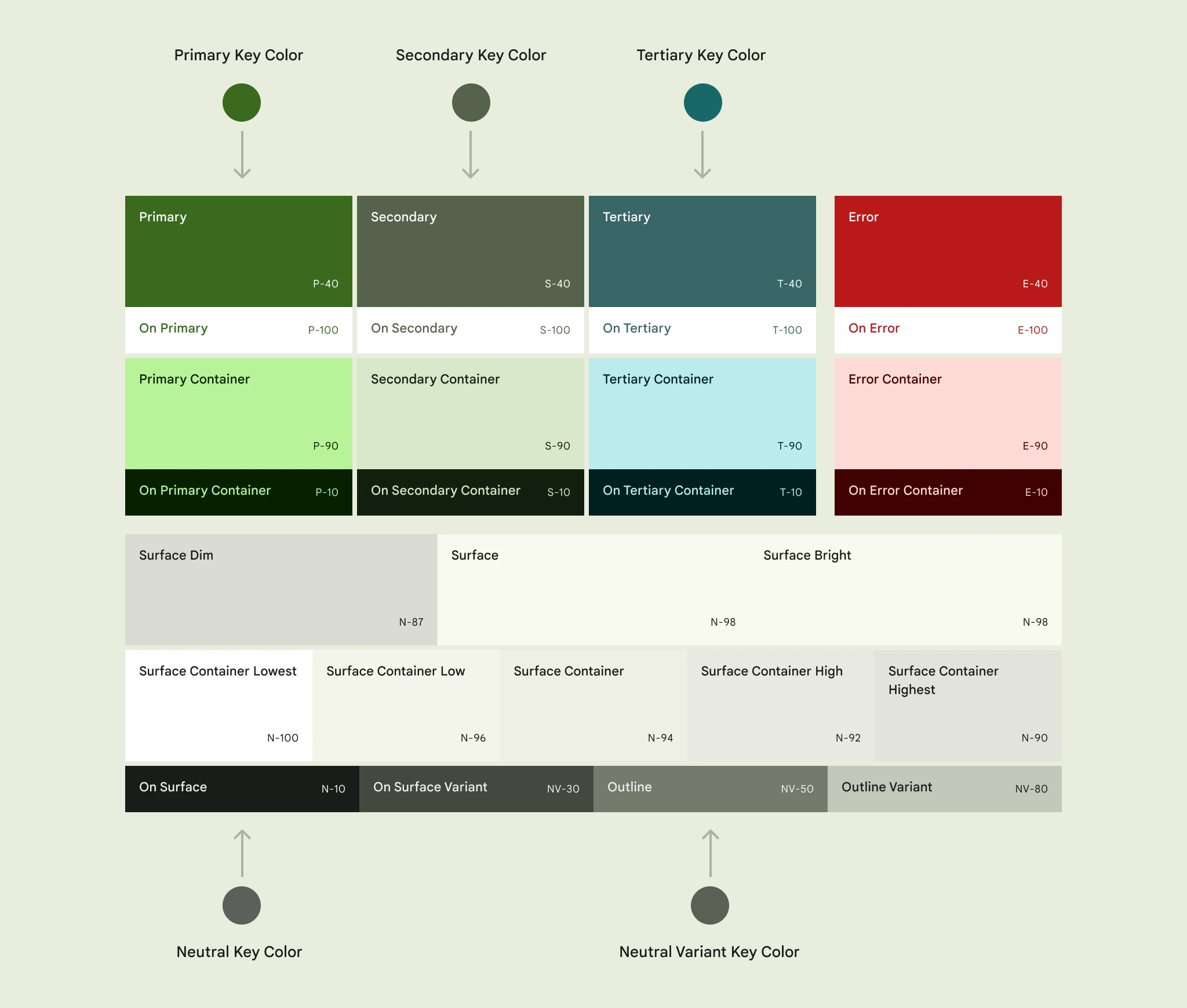
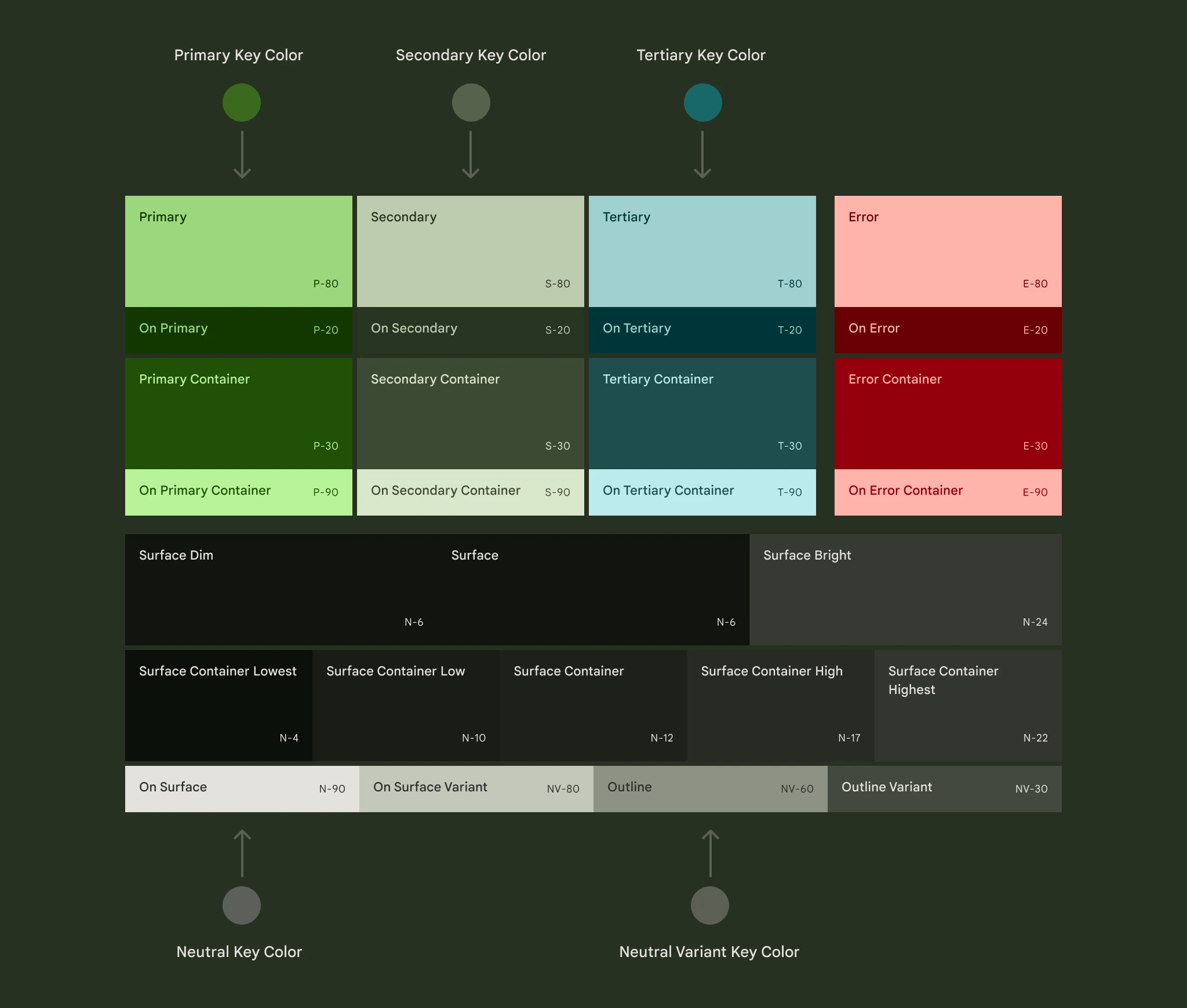
In labs/gb:
md-color-tokens.cssis the static baseline: every role as a--md-sys-color-<role>custom property, with light and dark values.md-color-tokens-contrast.cssadds medium and high contrast. High contrast followsprefers-contrast: more, and.md-contrast-standard,.md-contrast-mediumand.md-contrast-highselect a level for a subtree.md-color-tokens-full.cssalso declares the reference palette (--md-ref-palette-*), the tonal palettes the roles are picked from.dynamic-color.tsruns the generation steps at runtime with Material Color Utilities (see Dynamic color below).
The new tone-based surface roles (container levels, dim, and bright) and the fixed accent roles from the latest spec are all part of the tokens, so nothing extra is needed to use them. HCT is also available as a small API (see Advanced customization).
Color roles
Link to “Color roles”A role is a named job for a color, not a specific hue. Components read roles
(primary, surface-container) instead of hex values, so a new scheme
re-themes everything. The spec groups them as accent roles (primary,
secondary, tertiary, error, each with on-, -container and on-container
variants), surface roles with on-surface and on-surface-variant, outline
roles, inverse roles, and add-on roles: fixed accents and bright and dim
surfaces. Layer from lower to higher emphasis, and always put on- content on
its matching background.
| Role | Tokens |
|---|---|
| Primary, secondary, tertiary | --md-sys-color-<accent>, -on-<accent>, -<accent>-container, -on-<accent>-container |
| Fixed accents | --md-sys-color-<accent>-fixed, -<accent>-fixed-dim, -on-<accent>-fixed, -on-<accent>-fixed-variant |
| Error | --md-sys-color-error, -on-error, -error-container, -on-error-container |
| Surface | --md-sys-color-surface, -surface-dim, -surface-bright, -surface-container-lowest through -surface-container-highest, -on-surface, -on-surface-variant |
| Outline | --md-sys-color-outline, -outline-variant |
| Inverse | --md-sys-color-inverse-surface, -inverse-on-surface, -inverse-primary |
| Other | --md-sys-color-scrim, -shadow |
Fixed accents keep the same value in light and dark themes, for content that
should not flip, such as a brand surface. Use surface-dim and
surface-bright for areas that stay darker or brighter than the main surface
in both themes.
<div class="card">
  Inbox
  <span class="badge">3 new</span>
</div>
.card {
padding: 16px;
border-radius: 12px;
background: var(--md-sys-color-surface-container-high);
color: var(--md-sys-color-on-surface);
border: 1px solid var(--md-sys-color-outline-variant);
}
.card .badge {
padding: 2px 8px;
border-radius: 8px;
background: var(--md-sys-color-tertiary-container);
color: var(--md-sys-color-on-tertiary-container);
}Light and dark
Link to “Light and dark”The tokens use light-dark(), so they follow the standard color-scheme
property. Where light-dark() is not available, the Baseline fallback keeps
the light values and switches to the dark values with prefers-color-scheme.
<div class="box">Follows the system</div>
<div class="box always-dark">Always dark</div>
:root {
color-scheme: light dark; /* follow the system */
}
.always-dark {
color-scheme: dark;
}
.box {
padding: 16px;
border-radius: 12px;
background: Canvas;
color: CanvasText;
}The deprecated background and surface-tint roles are not defined; use
surface and a surface container instead.
Choosing a scheme
Link to “Choosing a scheme”Pick static color when you want a fixed, predictable palette: a brand identity, a product with a strict visual identity, or a small, controlled UI. Pick dynamic color when the palette should come from the person or the content: a wallpaper, a profile color, an album cover. You can also mix both: a dynamic scheme for most of the UI and static colors for brand and semantic meaning.
In labs/gb that is a choice of which stylesheet or function you load:
- Static: import
md-color-tokens.css(andmd-color-tokens-contrast.cssif you want contrast levels). No JavaScript. - Dynamic: call
themeFromSource(),themeFromImage()orapplyTheme(), which output the same custom properties and override the static ones.
Static color
Link to “Static color”The spec has two kinds. Baseline is the default purple scheme, ready to use and a good starting point for prototypes. Custom brand keeps the same roles but replaces the key colors with your brand colors, usually exported from the Material Theme Builder or a design tool.
Baseline in labs/gb is the default stylesheet. It is also part of m3Styles,
which adoptStyles() loads.
Primary container
<p class="sample">Primary container</p>@import '@material/web/labs/gb/styles/color/md-color-tokens.css';
.sample {
margin: 0;
padding: 16px;
border-radius: 12px;
background: var(--md-sys-color-primary-container);
color: var(--md-sys-color-on-primary-container);
}For a custom brand scheme, override the tokens by hand, or generate the roles once and keep the CSS.
<md-gb-button color="filled">Save</md-gb-button>:root {
--md-sys-color-primary: light-dark(#006a6a, #4cdada);
--md-sys-color-on-primary: light-dark(#ffffff, #003737);
/* ... the rest of the roles you need ... */
}<md-gb-button color="filled">Save</md-gb-button>import {
themeFromSource,
themeToCss,
} from '@material/web/labs/gb/styles/color/dynamic-color.js';
const css = themeToCss(themeFromSource({source: '#006a6a'}));
// Ship the CSS in a stylesheet, or add it to the page.
const style = document.createElement('style');
style.textContent = css;
document.head.append(style);To start from a Material Theme Builder export, pass its JSON to
themeFromThemeBuilder(), or apply it live with themeOptionsFromThemeBuilder().
<md-gb-button color="filled">Save</md-gb-button>import {
applyTheme,
themeOptionsFromThemeBuilder,
} from '@material/web/labs/gb/styles/color/dynamic-color.js';
// Normally: await (await fetch('material-theme.json')).json()
const json = {seed: '#006a6a', variant: 'tonal-spot'};
applyTheme(document, themeOptionsFromThemeBuilder(json));The seed (or the core primary) is the source, other core colors become
palettes, extended colors become harmonized or exact customColors, and a
variant or contrast field in the file is used if present. The generated
schemes and palettes in the export are ignored, so the roles match the rest of
labs/gb. A second argument overrides any option.
Dynamic color
Link to “Dynamic color”A dynamic scheme is generated from a source. The spec distinguishes
user-generated color (a wallpaper or a person's pick, usually with the
tonal-spot variant), content-based color (taken from an image or content
on screen, with the content variant), and multiple sources (several
schemes on one screen, each scoped to a region).
<md-gb-button color="filled">Save</md-gb-button>import {applyTheme} from '@material/web/labs/gb/styles/color/dynamic-color.js';
applyTheme(document, {
source: '#006a6a',
variant: 'tonal-spot',
contrast: 'medium',
});For content-based color, scope the scheme to one element with a source taken from an image:
<div id="card" class="card">
  <img id="cover" alt="A magenta cover" width="64" height="64"
    src="data:image/svg+xml,%3Csvg xmlns='http://www.w3.org/2000/svg' width='8' height='8'%3E%3Crect width='8' height='8' fill='%23c2185b'/%3E%3C/svg%3E">
  <md-gb-button>Play</md-gb-button>
</div>
.card {
display: flex;
align-items: center;
gap: 16px;
padding: 16px;
border-radius: 16px;
background: var(--md-sys-color-primary-container);
}import {
applyTheme,
sourceColorFromImage,
} from '@material/web/labs/gb/styles/color/dynamic-color.js';
const card = document.querySelector('#card') as HTMLElement;
const img = document.querySelector('#cover') as HTMLImageElement;
applyTheme(card, {source: await sourceColorFromImage(img), variant: 'content'});To get the theme without applying it, use themeFromSource() or
themeFromImage(img), and themeToStyleSheet(theme) for a stylesheet.
- Variants:
tonal-spot,neutral,vibrant,expressive,fidelity,content,monochrome,rainbow, andfruit-salad. The spec page does not define these variants or any version of their rules; they come from Material Color Utilities, which has 2025 rules only for tonal spot, neutral, vibrant and expressive. The others use the original rules, so labs/gb does too.theme.specVersionreports what was used. - Contrast:
standard,medium,high, or a number from -1 to 1.applyTheme()acceptscontrast: 'auto', which uses high contrast when the user prefers more contrast. - Platform:
phone(also right for the web) orwatch. applyTheme(target, ...)accepts a document, a shadow root, or an element. An element gets inline custom properties, so its subtree has its own scheme.clearTheme()removes it.- Android's system-wide wallpaper source and the Material Theme Builder preview are not part of labs/gb; the library only generates the scheme.
When using content-based color, keep semantic colors (error, success) stable and make sure the surrounding UI stays readable if the image is very saturated or very dark. The scheme already guarantees accessible on-color pairs.
Advanced customization
Link to “Advanced customization”The spec lists three kinds of customization. This table shows what labs/gb covers.
| Spec topic | In labs/gb |
|---|---|
| Combine multiple color schemes | Yes: call applyTheme(element, ...) on different elements, each with its own source, variant and contrast. |
| Map or remap colors on UI elements | Yes: components read roles, so reassign a role in CSS (--md-sys-color-surface: var(--md-sys-color-surface-container);) on a subtree. |
| Define static colors | Yes: customColors adds a color with four roles. |
| Define custom color roles | Yes: customRoles takes a name, a palette and a tone for light and dark (optionally per contrast level). |
| Define your own baseline scheme | Yes: override the static tokens, or pass palettes. |
| Define your own dynamic scheme | Yes: palettes takes your own primary, secondary, tertiary, neutral, neutral variant and error key colors. |
| Use color fidelity | Yes: fidelity per role. |
| Harmonize colors | Yes: customColors harmonize toward the source by default, and harmonize(color, source) is exported. |
<span class="swatch success">Success</span>
<span class="swatch brand">Brand</span>
.swatch {
padding: 8px 16px;
border-radius: 8px;
}
.success {
background: var(--md-sys-color-success-container);
color: var(--md-sys-color-on-success-container);
}
.brand {
background: var(--md-sys-color-brand-container);
color: var(--md-sys-color-on-brand-container);
}import {applyTheme} from '@material/web/labs/gb/styles/color/dynamic-color.js';
applyTheme(document, {
source: '#6750a4',
// A static color gets --md-sys-color-success, -on-success,
// -success-container and -on-success-container.
customColors: [
{name: 'success', value: '#2e7d32'}, // harmonized
{name: 'brand', value: '#ff5722', harmonize: false}, // exact
],
// Keep this role's tones close to the source color.
fidelity: {'primary-container': true},
// Use your own key color for one palette.
palettes: {tertiary: '#b3261e'},
});Harmonize colors that carry meaning but should still sit in the theme, such as success and warning. Do not harmonize brand colors that must stay exact.
Custom color roles
Link to “Custom color roles”A custom role is one color picked from a palette at a reference tone, for light
and dark, so it follows the source color and the contrast level like the
built-in roles. It makes --md-sys-color-<name> only; pick a tone that
meets contrast against the role it sits on (3:1 for graphics) and check the
pair yourself.
<span class="swatch graphic">primary-graphic</span>
<span class="swatch warning">warning</span>
.swatch {
padding: 8px 16px;
border-radius: 8px;
color: black;
}
.graphic {
background: var(--md-sys-color-primary-graphic);
}
.warning {
background: var(--md-sys-color-warning);
}import {applyTheme} from '@material/web/labs/gb/styles/color/dynamic-color.js';
applyTheme(document, {
source: '#6750a4',
customRoles: [
// Primary palette, tone 50 in light, 70 in dark; darker with more contrast.
{
name: 'primary-graphic',
palette: 'primary',
tone: {
light: {standard: 50, medium: 40, high: 30},
dark: {standard: 70, medium: 80, high: 90},
},
},
// Your own palette (hex, or {hue, chroma}) instead of a scheme palette.
{name: 'warning', source: '#ff9800', tone: {light: 40, dark: 80}},
],
});palette is one of primary, secondary, tertiary, neutral,
neutralVariant, error. Tones are 0 to 100; a number applies to both themes.
HCT
Link to “HCT”Colors in the system are built in HCT (hue, chroma, tone). To work in it yourself:
<output id="out"></output>import {hctFromColor, hctToHex, hctWith} from '@material/web/labs/gb/styles/color/dynamic-color.js';
const {hue, chroma, tone} = hctFromColor('#6750a4');
const lighter = hctToHex({hue, chroma, tone: 90}); // the same color, lighter
const darker = hctWith('#6750a4', {tone: 20}); // change one channel
document.querySelector('#out')!.textContent = `${lighter} and ${darker}`;Colors outside the sRGB range are brought in by lowering chroma.
Prefer an existing role before adding custom colors, and keep contrast pairs
accessible; customColors roles follow the same on-color convention as the
accents.
Resources
Link to “Resources”The spec's resources page links to the Material Theme Builder, the Figma plugin, and tutorials and codelabs. For code:
- Material Theme Builder Figma plugin to design a scheme and export tokens.
material-color-utilities, the librarydynamic-color.tsis built on.- Color on m3.material.io for the full guidance.