Theming
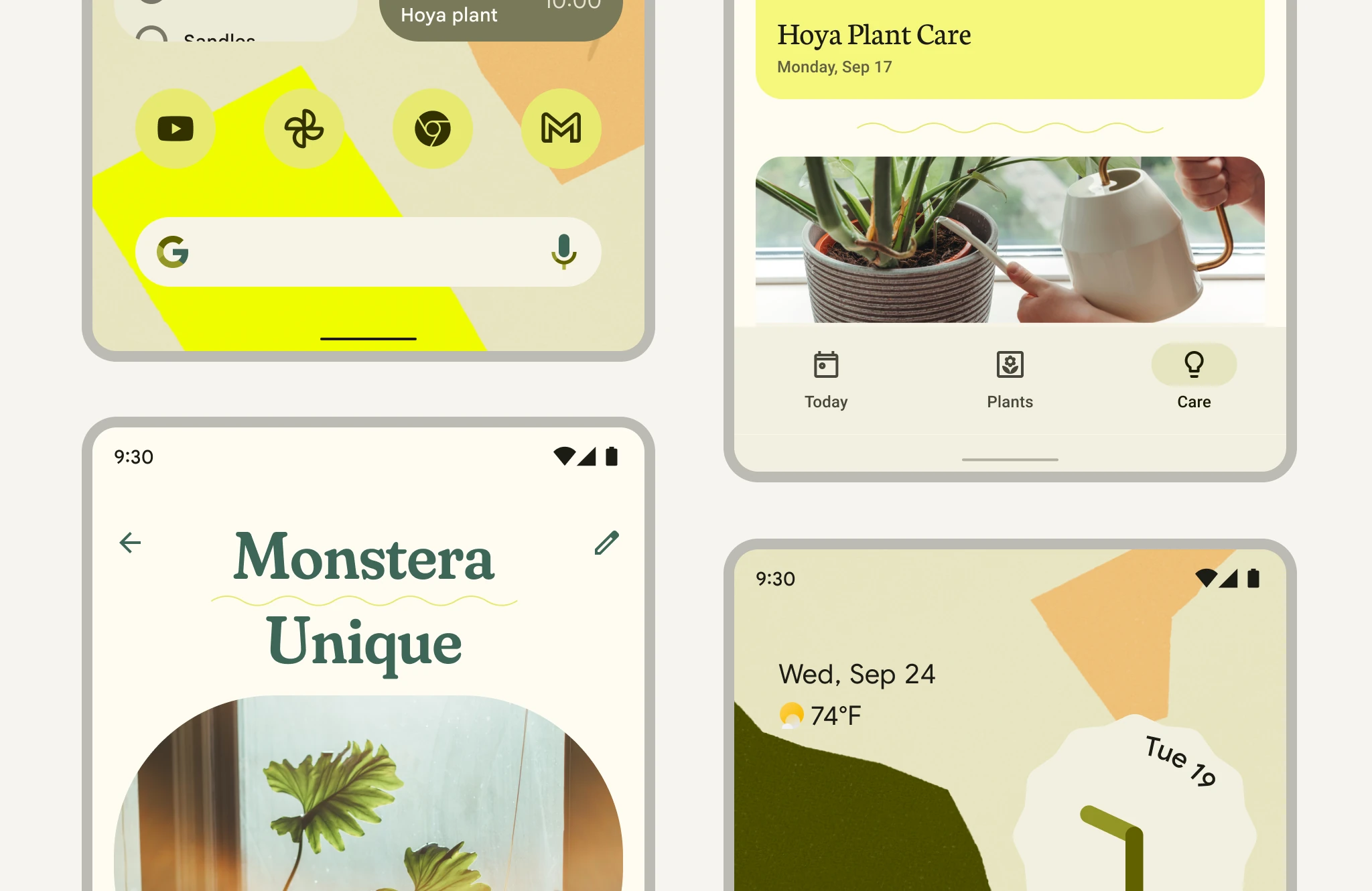
Material Design theming creates unique branded products with familiar patterns and accessible interactions.
Tokens
Link to “Tokens”Material is expressed in design tokens, which are the building blocks of all UI elements.
In 3.0, the md-gb-* elements are themed with system tokens, which map
roles to concrete reference values. Load them once for the document with
adoptStyles(), then override any token with CSS.
<md-gb-button color="filled">Save</md-gb-button>import {adoptStyles} from '@material/web/labs/gb/styles/adopt-styles.js';
import {styles as m3Styles} from '@material/web/labs/gb/styles/m3.cssresult.js';
adoptStyles(document, [m3Styles]);System tokens are
CSS custom properties
in the md.sys.* cascade layers, so unlayered CSS always wins and they can be
scoped with any selector.
<div class="square-corners">
  <md-gb-button color="filled">Save</md-gb-button>
</div>
.square-corners {
/* Applies to every md-gb-* element inside the selector */
--md-sys-shape-corner-full: 0px;
}System
Link to “System”System tokens define the decisions and roles that give the design system its character: color, typography, shape, elevation, space, and motion.
Color
Link to “Color”--md-sys-color tokens define the dynamic color roles. They
use light-dark(), so they follow color-scheme. See the
color guide.
<md-gb-button color="filled">Save</md-gb-button>:root {
color-scheme: light dark;
--md-sys-color-primary: light-dark(red, pink);
}Typography
Link to “Typography”--md-sys-typescale tokens define the type scale,
including the emphasized styles. See the typography guide.
Your draft was saved to the inbox.
<p class="body">Your draft was saved to the inbox.</p>:root {
--md-sys-typescale-body-md-size: 1.25rem;
--md-sys-typescale-body-md-line-height: 1.75rem;
}
.body {
margin: 0;
font-size: var(--md-sys-typescale-body-md-size);
line-height: var(--md-sys-typescale-body-md-line-height);
}Shape
Link to “Shape”--md-sys-shape tokens define the corner scale, including
single-corner values. See the shape guide.
<div class="box">Medium corners</div>:root {
--md-sys-shape-corner-md: 12px;
--md-sys-shape-corner-lg: 16px;
}
.box {
padding: 24px 32px;
background: var(--md-sys-color-primary-container);
color: var(--md-sys-color-on-primary-container);
border-radius: var(--md-sys-shape-corner-md);
}Motion
Link to “Motion”--md-sys-motion tokens define the motion scheme: spring tokens
(--md-sys-motion-spring-<speed>-<spatial|effects>, each with a matching
-duration), easing curves, and durations. Springs are linear() easings.
The standard scheme applies to elements inside .md-motion-standard.
<md-gb-button id="slide" color="filled">Slide</md-gb-button>
<div id="panel" class="panel">Panel</div>
.panel {
margin-block-start: 16px;
padding: 12px 16px;
inline-size: fit-content;
border-radius: var(--md-sys-shape-corner-md);
background: var(--md-sys-color-secondary-container);
color: var(--md-sys-color-on-secondary-container);
transition: translate var(--md-sys-motion-spring-default-spatial-duration)
var(--md-sys-motion-spring-default-spatial);
}
.panel.moved {
translate: 160px 0;
}document.querySelector('#slide').addEventListener('click', () => {
document.querySelector('#panel').classList.toggle('moved');
});Component
Link to “Component”The md-gb-* elements do not expose per-component tokens. Change how a
component looks by changing the system tokens it uses (color roles, typescale
styles, shape corners, motion), by scoping them to a selector, or with the
component's attributes such as variant and size.
<md-gb-button class="error" color="filled">Delete</md-gb-button>md-gb-button.error {
--md-sys-color-primary: var(--md-sys-color-error);
--md-sys-color-on-primary: var(--md-sys-color-on-error);
}