Introduction
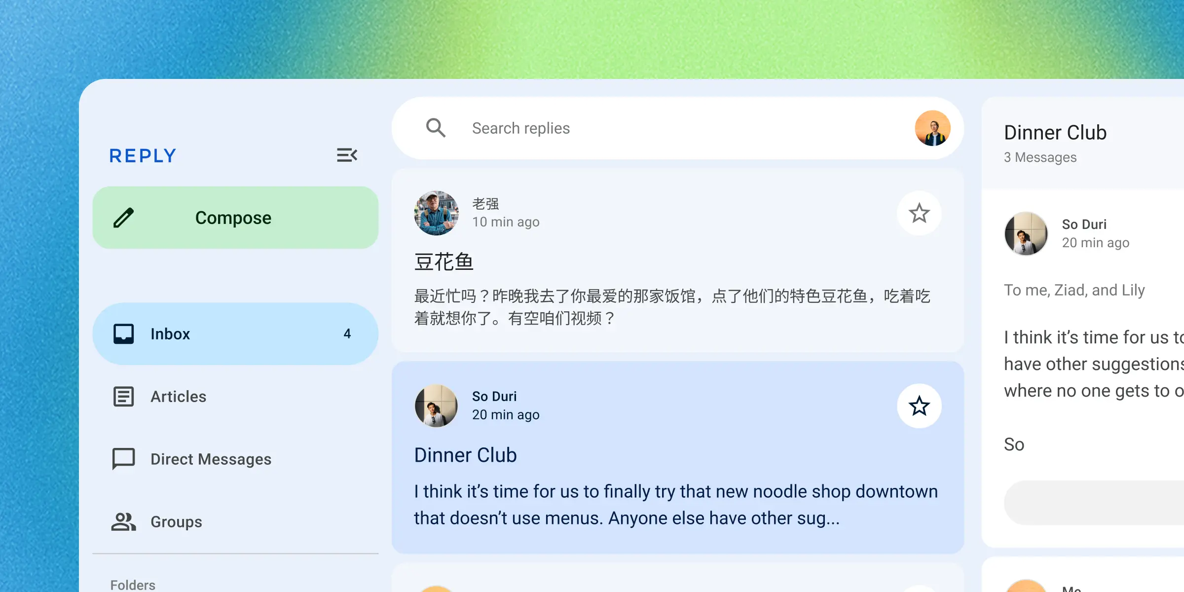
Material web, also known as Material Web Components or MWC, is a library of web components that follows Google's Material Design guidelines.
What is Material?
Link to “What is Material?”Material Design is a design system built and supported by Google designers and developers. Guidelines for building Material apps and components are published on material.io.
Version 3.0 implements Material 3 Expressive, the latest evolution of
Material 3: a larger shape scale with shape morphing, spring-based motion, an
emphasized type scale, and an updated dynamic color system. The elements are
named md-gb-*, follow the
WAI-ARIA patterns for their roles, and
only rely on web platform features that are
Baseline widely available (newer features are
guarded and degrade gracefully).
What are web components?
Link to “What are web components?”Web components are custom HTML elements with encapsulated styles and behavior. They work across many different frameworks (such as Lit, React, Vue, and Svelte) as well as web environments (such as Eleventy, Wordpress, and Ruby on Rails).
Many components in this library are drop-in replacements for browser elements
like <button> and <input>. Every element is prefixed with md-gb-.
<form>
  <md-gb-text-field label="Email" type="email" name="email" required></md-gb-text-field>
  <md-gb-button color="filled">Subscribe</md-gb-button>
</form>
What are tokens?
Link to “What are tokens?”Design tokens are the building blocks of all UI elements. Here they are CSS custom properties that you can override to style components. Version 3.0 provides the system tokens for color, typography, shape, elevation, space, and motion.
<md-gb-button color="filled">Subscribe</md-gb-button>:root {
--md-sys-color-primary: light-dark(olive, khaki);
--md-ref-typeface-plain: 'Open Sans', system-ui;
}